

ChatHistory Component
The conversation history sidebar. Chat renders it for you (showHistory); use it directly in a custom layout.
New in 0.4.0
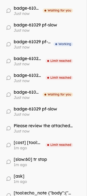
Status badges, rows that are real buttons with arrow-key navigation, and, switched on by the host, rename, pin and select-and-delete (onRename, onPin, onBulkDelete).
Import
import { ChatHistory } from "@cognipeer/chat-ui";Usage
const history = useChatHistory({ baseUrl: "/api/agents" });

<ChatHistory
  conversations={history.conversations}
  selectedId={chat.conversation?.id}
  isLoading={history.isLoading}
  hasMore={history.hasMore}
  onSelect={(item) => chat.loadConversation(item.id)}
  onDelete={history.deleteConversation}
  onNewChat={chat.clearMessages}
  onLoadMore={history.loadMore}
/>Props
| Prop | Type | Default | Description |
|---|---|---|---|
conversations | ConversationListItem[] | required | The list |
selectedId | string | - | The open conversation |
onSelect | (item: ConversationListItem) => void | required | A row was opened |
onDelete | (id: string) => void | - | Shows a delete button on each row |
onRename | (id, title) => Promise<boolean | void> | boolean | void | - | Enables rename: a pencil button on each row, F2 on a focused row, or a double click. Enter or leaving the field saves, Escape keeps the old title (200 characters at most). Resolve false when the title was refused |
onPin | (id, pinned) => Promise<boolean | void> | boolean | void | - | Enables a pin button on each row. Pinned conversations (pinned or metadata.pinned) are listed first and show a pin icon |
onBulkDelete | (ids) => Promise<{ deleted: string[]; failed: string[] } | void> | ... | - | Enables "Select": rows become checkboxes with Select all / Done, "Delete selected (n)" and a confirmation. What could not be deleted stays selected |
error, onDismissError | string, () => void | - | A message shown under the list (a refused rename, pin or delete) and a close button for it |
onNewChat | () => void | - | Shows the "New Chat" button |
isLoading, hasMore, onLoadMore | Paging; a "Load more" button shows while hasMore | ||
enableSearch | boolean | false | A search box over the titles |
showAgentName | boolean | false | The agent's name next to the time |
showStatus | boolean | true | A badge on rows that are working, waiting for you or stopped on their usage limit |
selectedStatus | RuntimeStatus | - | What the open conversation is doing, as this page knows it; replaces the badge of the selected row |
isOpen, onClose | boolean, () => void | true, - | The sidebar as an overlay on small screens (a backdrop, Escape closes it); from the md breakpoint up it is always visible |
header, footer | ReactNode | Replace the header or add a footer | |
className | string | - | Container class name |
Status badges
Each ConversationListItem may carry runtime (agent-server 0.3.0+). The badge:
runtime.status | Badge |
|---|---|
running | Working |
requires_action | Waiting for you |
budget_paused, or budget spent (spentUsd >= budget.maxCostUsd) | Limit reached |
idle, absent | none |
Chat passes selectedStatus for the open conversation, because it knows before the list does, and fetches the list again when a turn ends. In your own layout refresh the list when the status may have changed (useChatHistory().refresh()).
Keyboard
Every row is a real <button>, in a labelled list:
- Tab, Enter, Space - reach and open a conversation (
aria-currentmarks the open one); - Arrow Up / Down, Home, End - move between rows;
- Escape - closes the sidebar where it is an overlay;
- the delete, rename and pin buttons are buttons of their own (named after the conversation: "Delete conversation: Quarterly report"), hidden until the row is hovered or has keyboard focus, and they do not open the row. A pin button is
aria-pressed; - F2 on a focused row starts a rename (when
onRenameis given); - in select mode every row is a labelled checkbox, the count is announced, and the confirmation is an
alertdialog.
Conversation structure
interface ConversationListItem {
  id: string;
  title?: string;
  agentName?: string;
  agentId: string;
  runtime?: ConversationRuntime;     // { status, stopReason?, lastEventSeq?, ... }
  budget?: ConversationBudget | null;
  spentUsd?: number;
  pinned?: boolean;
  metadata?: Record<string, unknown>;
  createdAt: Date;
  updatedAt: Date;
}Examples
With search
<ChatHistory
  conversations={conversations}
  enableSearch
  onSelect={handleSelect}
  onDelete={handleDelete}
  onNewChat={handleNew}
/>With rename, pin and bulk delete
const history = useChatHistory({ baseUrl: "/api/agents" });

<ChatHistory
  conversations={history.conversations}
  onSelect={handleSelect}
  onRename={history.canRename ? history.renameConversation : undefined}
  onPin={history.canPin ? history.pinConversation : undefined}
  onBulkDelete={history.deleteConversations}
  error={history.error?.message}
/>Without badges
<ChatHistory conversations={conversations} showStatus={false} onSelect={handleSelect} />Collapsible sidebar
function CollapsibleHistory() {
  const [open, setOpen] = useState(false);
  return (
    <>
      <button onClick={() => setOpen(true)}>Menu</button>
      <ChatHistory conversations={conversations} isOpen={open} onClose={() => setOpen(false)} onSelect={handleSelect} />
    </>
  );
}Styling
The sidebar uses the theme variables: --chat-bg-secondary (background), --chat-bg-hover (the open row), --chat-bg-tertiary (hover), --chat-border-primary, and the status colours for the badges (--chat-info, --chat-warning, --chat-danger with their -bg tints). See Theming.