

Portal Components
The building blocks of the portal experience: the terms gate, announcements, the legal footer, the empty state with starters, the message toolbar, the feedback form, the message editor, the export menu and the notifications menu. Chat composes them from its props; use them directly when you build your own layout.
New in 0.4.0
All of these are new. Every one of them is opt-in.
Import
import {
  TermsGate, AnnouncementBanner, LegalFooter, ChatEmptyState, InfoMarkdown,
  MessageToolbar, FeedbackSheet, MessageEditor, ExportMenu, NotificationsMenu,
} from "@cognipeer/chat-ui";TermsGate
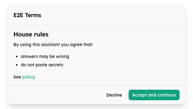
Wraps the chat; nothing inside is mounted until the person accepts. The host decides whether acceptance is required and records it.
| Prop | Type | Default | Description |
|---|---|---|---|
required | boolean | required | false shows the children at once |
title, body | string | required | Heading and the terms (Markdown) |
version | string | number | - | Changes whenever the terms do: a new version asks again |
onAccept | () => void | Promise<void> | required | Records the acceptance; if it throws, the dialog stays and says it could not be saved (or the localized message of a known code) |
onDecline | () => void | - | The person pressed Decline |
acceptLabel, declineLabel | string | localized | Button texts |
declinedTitle, declinedBody | string | localized | The screen after declining |
allowedImageHosts | string[] | any https host | Hosts a picture of the terms may come from |
className, children |
The dialog is role="dialog" with aria-modal, takes focus when it appears, and traps Tab.
AnnouncementBanner
<AnnouncementBanner
  announcements={[{ id: "maint-1", severity: "warning", text: "Maintenance **tonight** at 22:00." }]}
  onDismiss={(a) => saveDismissal(a.id)}
/>Shows the announcements due now (checked every 30 seconds), most severe first, at most five, with inline Markdown. A person can close the ones that allow it; the choice is kept in localStorage (cp:announcement:dismissed:<id>). A critical notice is role="alert", the others role="status".

LegalFooter
<LegalFooter links={{ privacy: "https://example.com/privacy", terms: "/terms", support: "mailto:help@example.com" }} text="Answers may be wrong." />A short text and the links in a fixed order (privacy, terms, support, "How this AI works"), in a nav labelled "Legal". A link that is not a plain web address, a page path (or mailto: for support) is left out. Chat puts it under the composer.
ChatEmptyState and InfoMarkdown
<ChatEmptyState
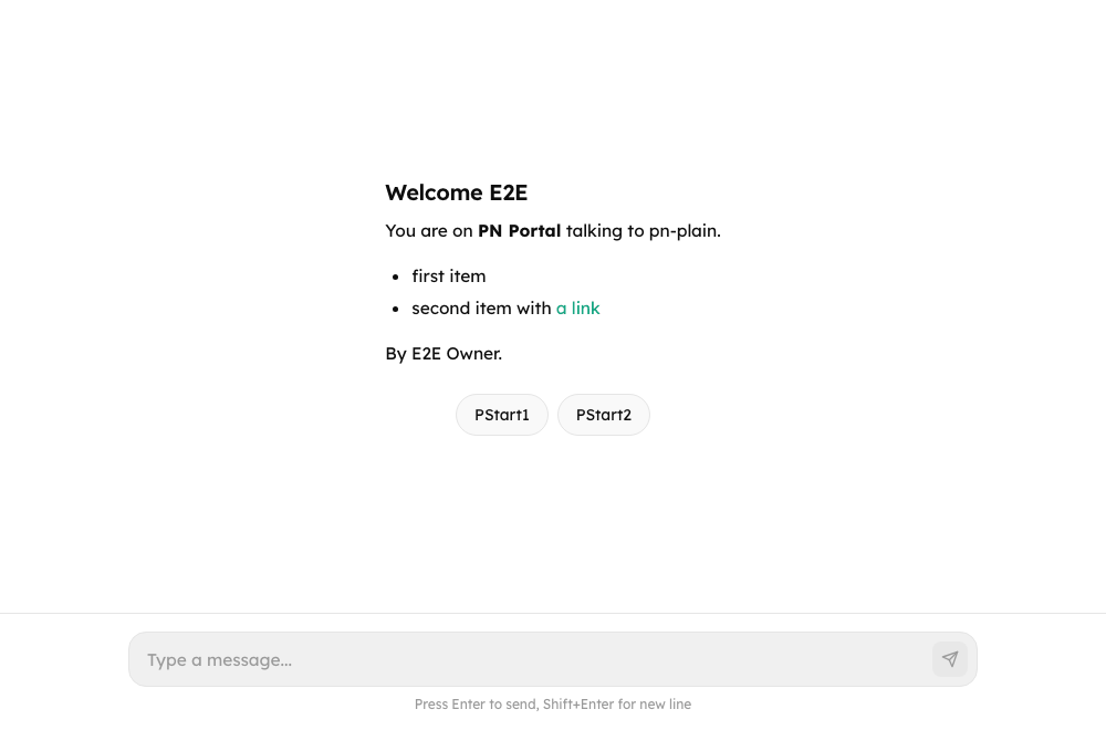
  welcome={"## Welcome back\n\nAsk me about orders."}
  starters={[{ text: "Where is my order?", label: "Track an order" }]}
  onPick={(starter) => composer.setValue(starter.text)}
/>| Prop | Description |
|---|---|
custom | The host's own empty state (replaces the welcome and the default text) |
welcome | Markdown shown before the first message |
allowedImageHosts | Hosts a picture of the welcome may come from |
starters | ConversationStarter[], shown as chips (a list labelled "Suggested messages") |
onPick | A chip was chosen |
disabled | The chips are not offered now (the composer is closed) |
InfoMarkdown is the safe Markdown renderer behind the welcome text and announcements: no raw HTML, links open in a new tab, pictures follow the rules above; inline allows only text, emphasis, code and links.
MessageToolbar
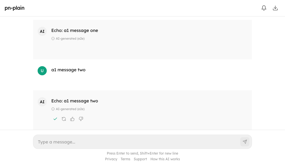
The row of buttons under a message: copy, edit, regenerate, thumbs.
<MessageToolbar
  text={messageText}
  copy
  onRegenerate={() => chat.regenerate()}
  feedback={{ comments: true, reasons: ["inaccurate", "other"], current: message.feedback, onSubmit: (input) => chat.submitFeedback(message.id, input) }}
  persistent
/>| Prop | Description |
|---|---|
text | What copy puts on the clipboard |
copy | Show the copy button |
onRegenerate, onEdit | Show the regenerate / edit button |
feedback | { comments, reasons, current?, onSubmit }: thumbs up and down; a thumbs-down opens the form |
persistent | Keep the row visible (otherwise it shows on hover and focus) |
The row is a role="group" labelled "Message actions"; pressed thumbs use aria-pressed, and copy and rating results are announced.
FeedbackSheet
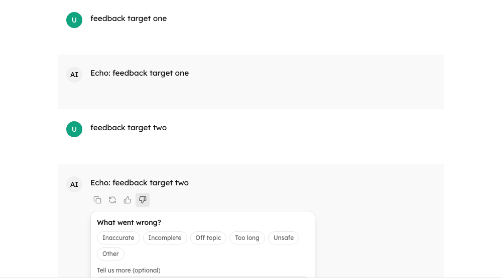
The form that opens with a thumbs-down.
<FeedbackSheet reasons={["inaccurate", "incomplete", "other"]} comments onSubmit={({ reasons, comment }) => send(reasons, comment)} onCancel={close} />| Prop | Description |
|---|---|
reasons | Reason ids (each has a chat.feedback.reason.<id> string; others show as written) |
comments | Offer the comment box (1000 characters at most) |
initial | What the person said before, when they come back to change it |
busy | The rating is being sent |
onSubmit, onCancel |
It is not modal: it takes focus when it opens, closes on Escape and returns focus to the thumb.
MessageEditor
Edits one of the person's messages in place. Saving sends it again and replaces everything the conversation said after it, which the editor says first.
| Prop | Description |
|---|---|
initial | The text being edited |
onSave(content) | Resolve false when the new text was refused (the editor stays open) |
onCancel |
Ctrl or Cmd + Enter saves, Escape cancels, and the box grows up to 320 px.
ExportMenu
<ExportMenu formats={["md", "json", "pdf"]} onExport={(format) => download(format)} disabled={chat.isStreaming} />A download button that opens a menu (role="menu") of formats: "Markdown (.md)", "JSON (.json)" and "PDF (print)". Arrow keys, Home, End and Escape work; focus returns to the button. The button is busy until onExport settles.
NotificationsMenu
const alerts = useBackgroundAlerts({ config, busy, waiting, heading, doneText, waitingText });
{alerts.available && <NotificationsMenu alerts={alerts} offer={{ sound: true, desktop: true }} />}A bell button that opens a dialog with two switches (role="switch"): "Play a sound" and "Desktop notifications". The browser's permission prompt appears only when the person turns desktop notifications on, and a blocked permission says so. offer is what the host allows.